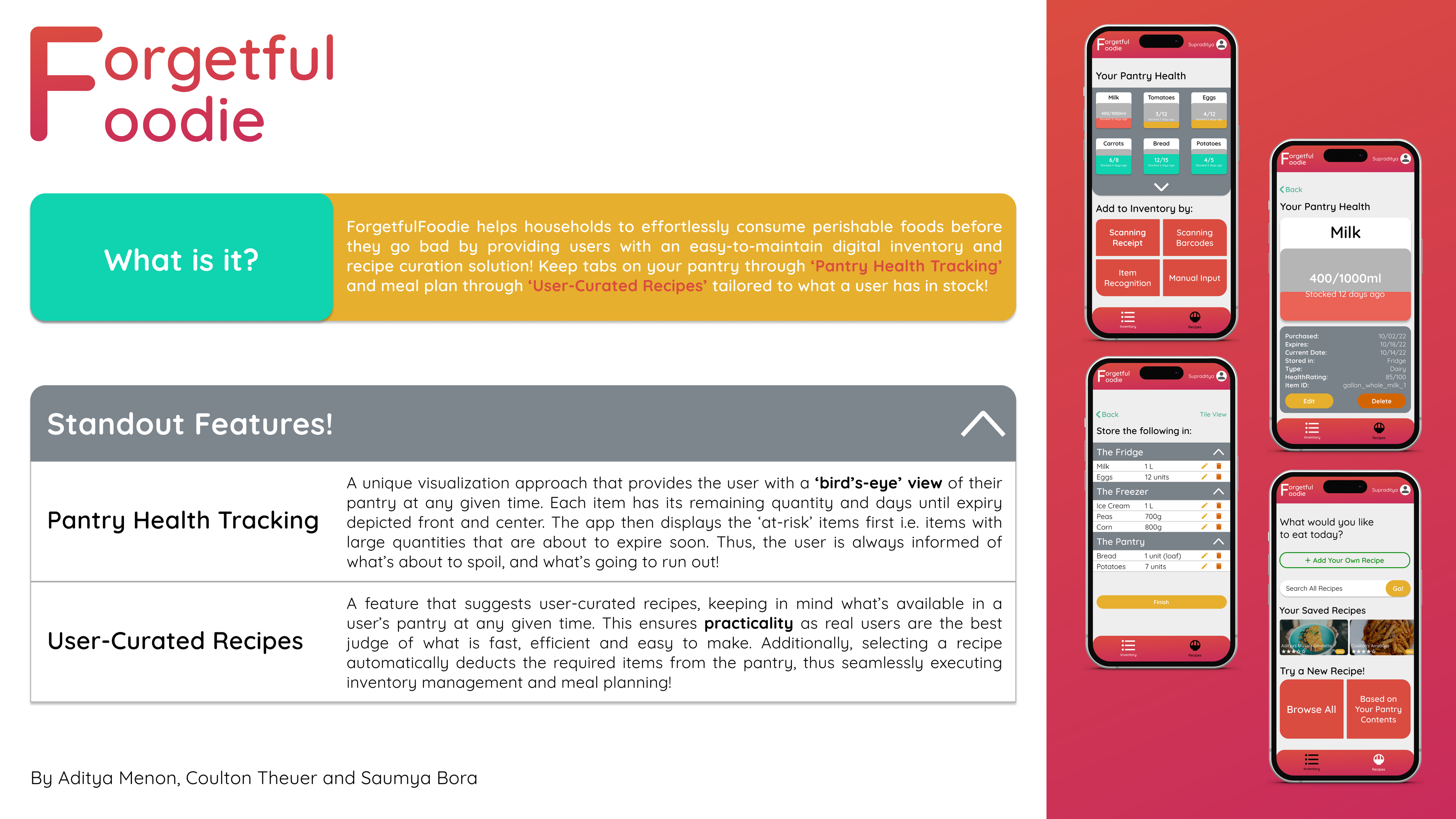
Forgetful Foodie
Always know what you have in the kitchen, and what dishes you can make using them.


Summary
Forgetful Foodie was ideated and designed as part of our coursework with the Master of Science in Information (MSI) program at the University of Michigan, for the course “Introduction to Interaction Design”. I collaborated with two fellow graduate students to ideate and design a smartphone application to reduce food wastage by streamlining pantry and inventory management for the average household owner.
My Roles: UX Designer, UX Researcher
Timeline: Aug 2022 - Dec 2022
Team Members: Saumya Bora, Coulton Theuer
Tools Used: Figma, Adobe Illustrator
Forgetful Foodie is under Active Development!
It's official: I'm personally developing and planning to publish Forgetful Foodie to iOS and Android using React Native! Here's the very first DevLog explaining my plans and motivation:
The Problem
Household food wastage has been a significant problem globally. According to the American Journal of Agricultural Economics, the average American household ends up wasting up to 31.9% of the food they purchase! This is caused in part due to the amount of mental effort required in keeping track of household food inventory so that everything is used up before it expires and the amount of time and effort it takes to meal-plan and determine the dish that tastes good, is easy to prepare, and uses an adequate amount of ingredients.
Thus, we wondered:
How might we help people safely consume all the highly perishable foods in their pantry without wastage, while simultaneously alleviating some of the mental burden of managing a household?
Our Initial Solution
This conundrum led us to come up with Forgetful Foodie: a smartphone application designed to help users consume all their perishable food items before they go bad through:
- Individual item age and quantity tracking
- By suggesting appropriate recipes to tactfully use at-risk ingredients!
Promotional Poster for Forgetful Foodie
Phase 1: Discovery and Research
We aimed to design primarily for adult grocery shoppers who shop on behalf of a household, either just for themselves or also for other loved ones. So, we interviewed a few of these potential users, from various age demographics, cultures, and ethnicities. Here are some interesting excerpts from the process:
Q. How do you keep track of your groceries?
"I visually inspect my pantry and fridge, and make mental notes of what I have and what I might soon run out of."
Q. Have you ever used technology to manage your pantry inventory or eating habits?
"I have often ordered groceries online, but tracking my pantry inventory and eating habits has been a chore to track digitally."
"I feel like micromanaging what I eat could lead to me developing an eating disorder."
"I feel like individually and painstakingly logging every single item I eat throughout the day is too much of a chore for me."
Q. How do you feel about personal food wastage?
"I feel extremely guilty. I hate wasting leftovers, so having to throw out ingredients as they expire before I can use them is a particularly frustrating process for me."
Insights Gathered
All in all, people rarely used dedicated applications to manage their pantry. They either took notes, or kept a mental note of what they had and needed soon.
- People were observed to keep track of pantry items through visual inspection and memory, which was found to be unreliable
- Existing apps meant to track inventory and eating habits were perceived to be 'too impractical to be convenient'
The interviewees primarily relied on visually examining their pantry contents and memorizing them, resulting in forgetfulness and food wastage. Doubt about the freshness of items and double-buying were common issues, indicating that this method is inadequate for tracking pantry inventory, as expressed by all participants.
While some interviewees found inputting every meal and minute details frequently into an app frustrating, another interviewee was concerned about developing eating disorders by tracking their eating habits too closely.
Phase 2: Design
After outlining the problem, and gathering insights, we began painting a picture with the information gathered. This led us to plotting out user scenarios, finalizing application features and flow, and collecting and reviewing peer and user feedback.
Storyboards
After interviewing our target demographic, we were able to get a better picture of why it tended to be so hard to avoid food wastage in our fast-paced daily lives. We began sketching out our findings, and ended up with the following scenarios:
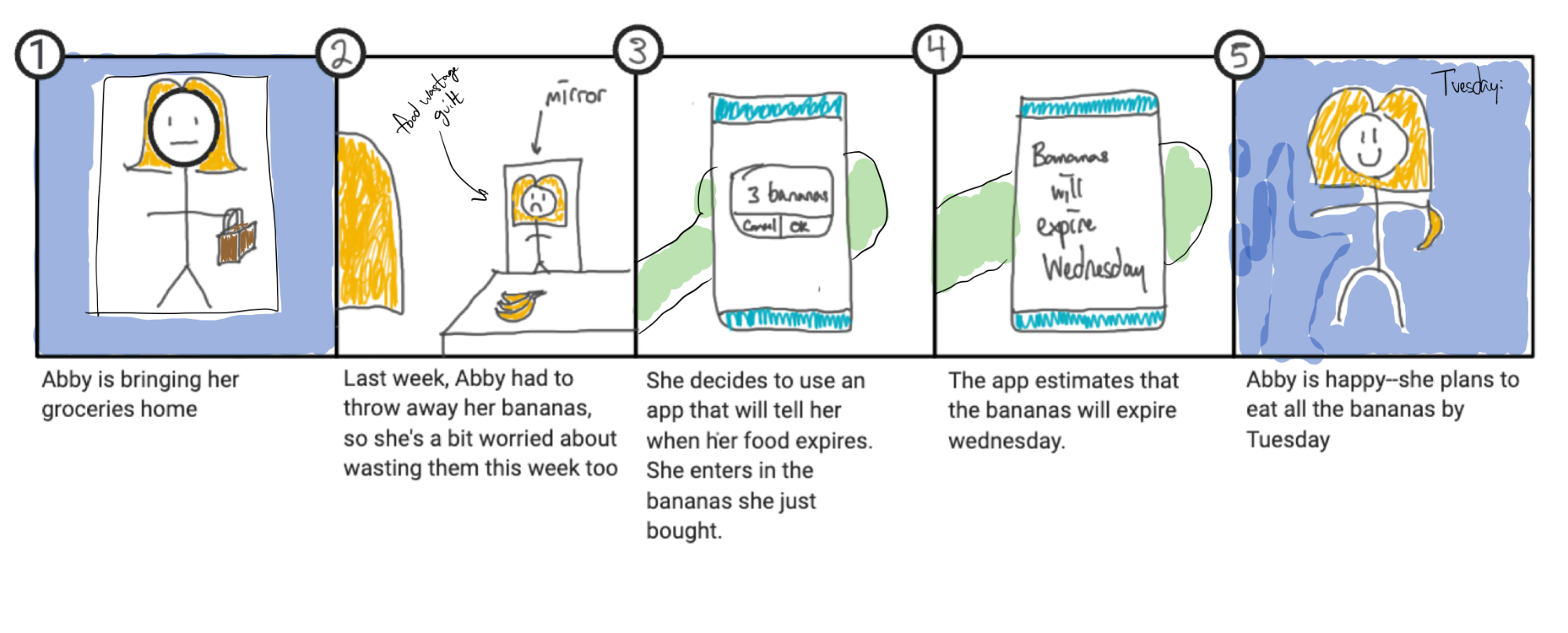
Scenario 1: Abby's Bananas
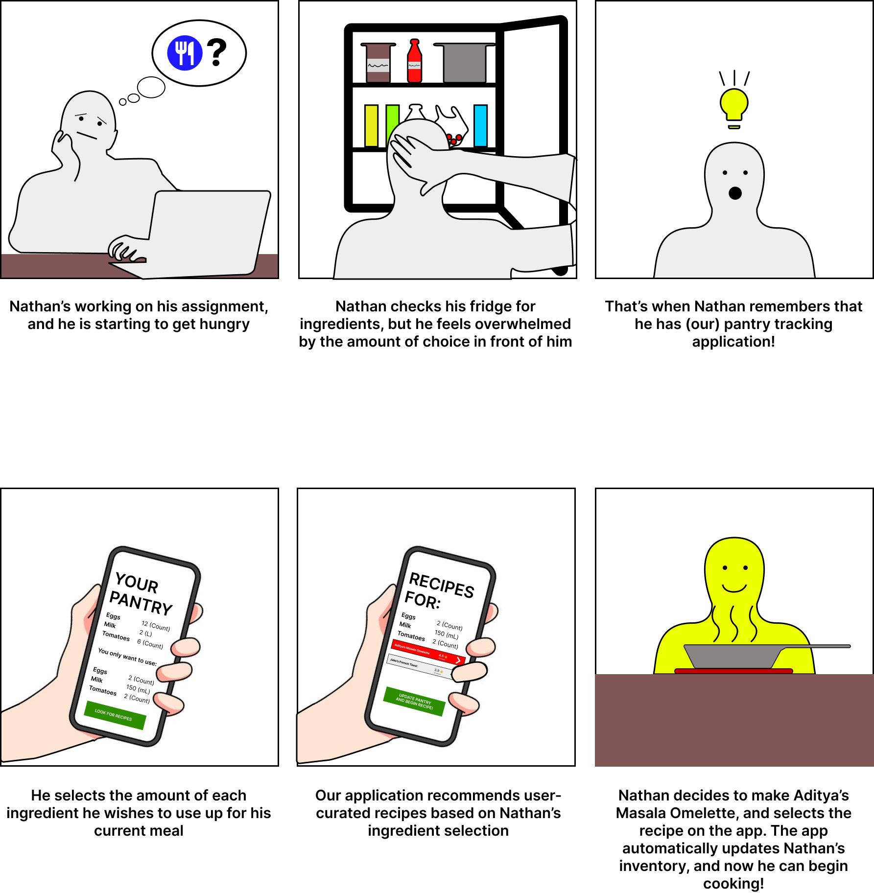
Scenario 2: Nathan's Dilemma
These illustrations were based off of a combination of insights gathered from our users, and from personal experiences handling and managing our own households. This gave us some definite problems to work towards solving, thus acting as a catalyst for ideation.
Our primary goals were:
- To intuitively visualize how much of something a user has, and when it will go bad
- To help users make tasty and nutritious meals out of whatever they have in the pantry at any given time, to ensure that nothing goes to waste!
Pain Points
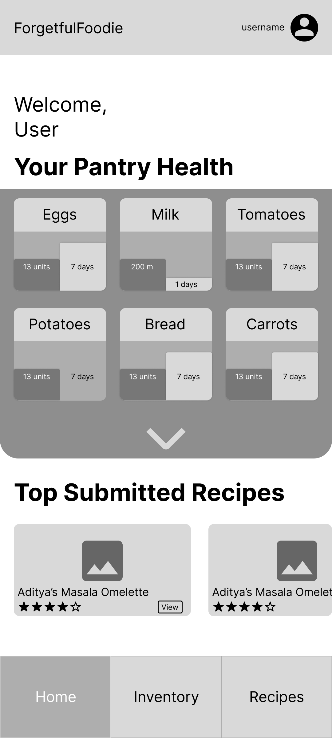
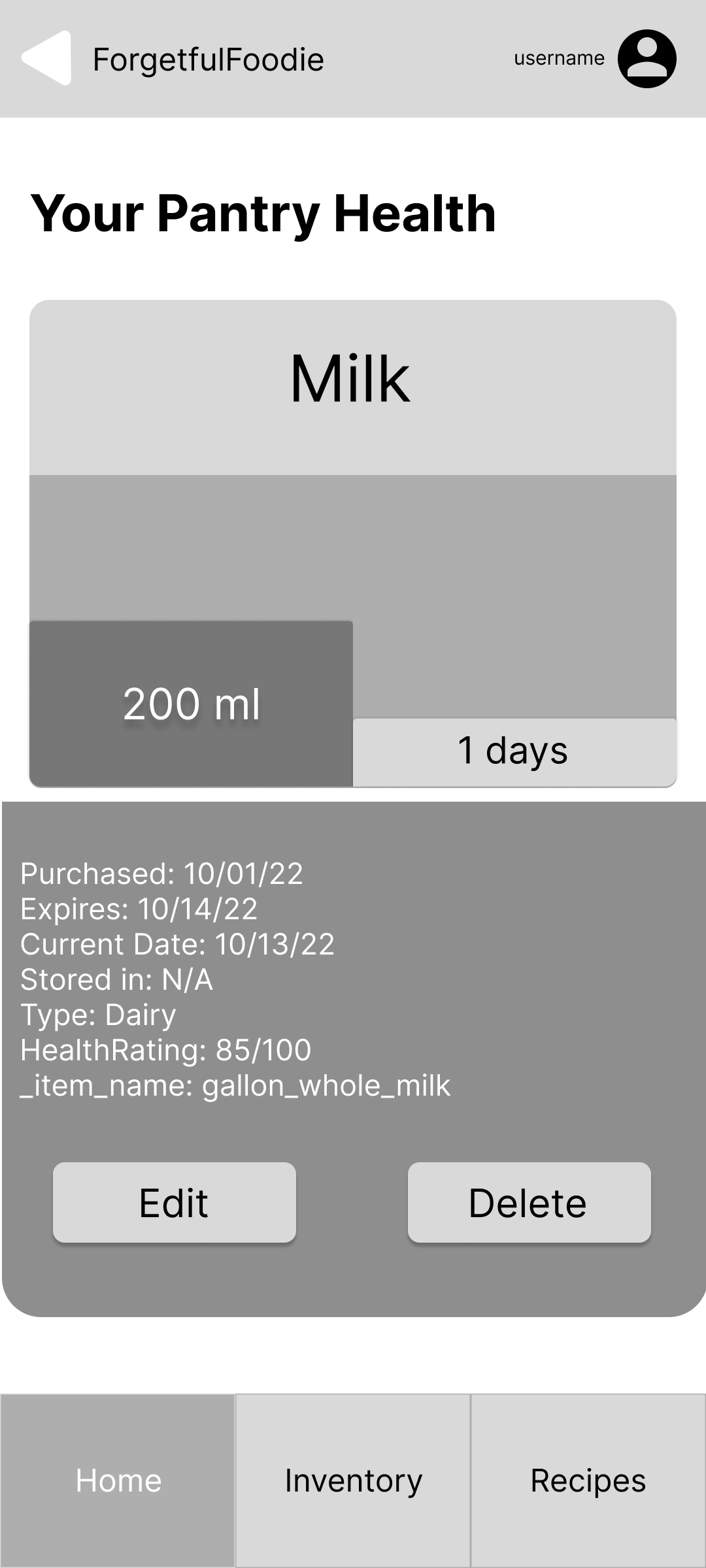
Based on the feedback we had received from the initial target users, we were determined to make forgetful foodie as convenient to use and update as possible. Our 'Pantry Health' feature, intended to allow users to quickly glance through what and how much of something they have at any given time, was the product of this thinking.
A few pain points that arose were:
- The tedium of updating one's inventory every time new things are bought and ready to be stored.
- The logging of individual items' expiry dates and their accuracy
- Sometimes recipes call for extremely specific ingredients, and can be either too difficult or time consuming to prepare for the everyday user.
We attempted to solve these problems through brainstorming appropriate features, which led to coming up with:
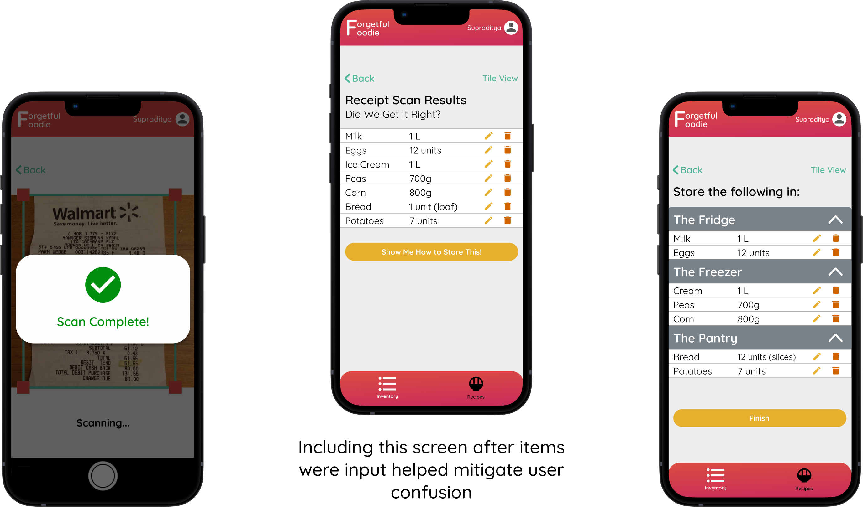
Alternative methods to update inventory such as receipt scanning, barcode scanning, item recognition
By using technologies such as object detection and OCR, we could make receipt scanning a viable option for users who've just bought groceries and are turned off by having to manually add each item into forgetful foodie before they even get to stocking it.
User-curated recipes that only display recipes to a user if they have most or all of the ingredients listed
We realized that by adding the user-curated spin to recipes, we can:
- Make recipe dishes realistic to prepare, and also gauge difficulty.
- Ensure that users are able to cook dishes that match the regional and cultural staples around them, and ensure that users are exposed to healthier 'home-cooked' options which are sustainable in the long term.
- We could also auto-deduct items for a user's inventory, thus eliminating an update step and improving the overall UX.
This led us to develop the initial user flow, and to illustrate the a lofi prototype of the UI through paper prototyping.
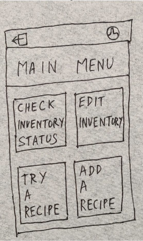
Paper Prototypes
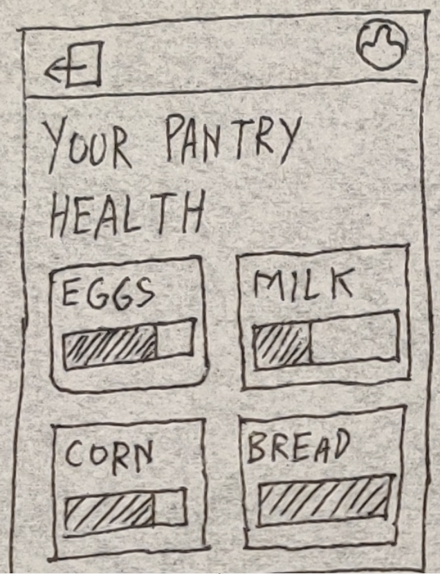
Flow 1: Pantry Health
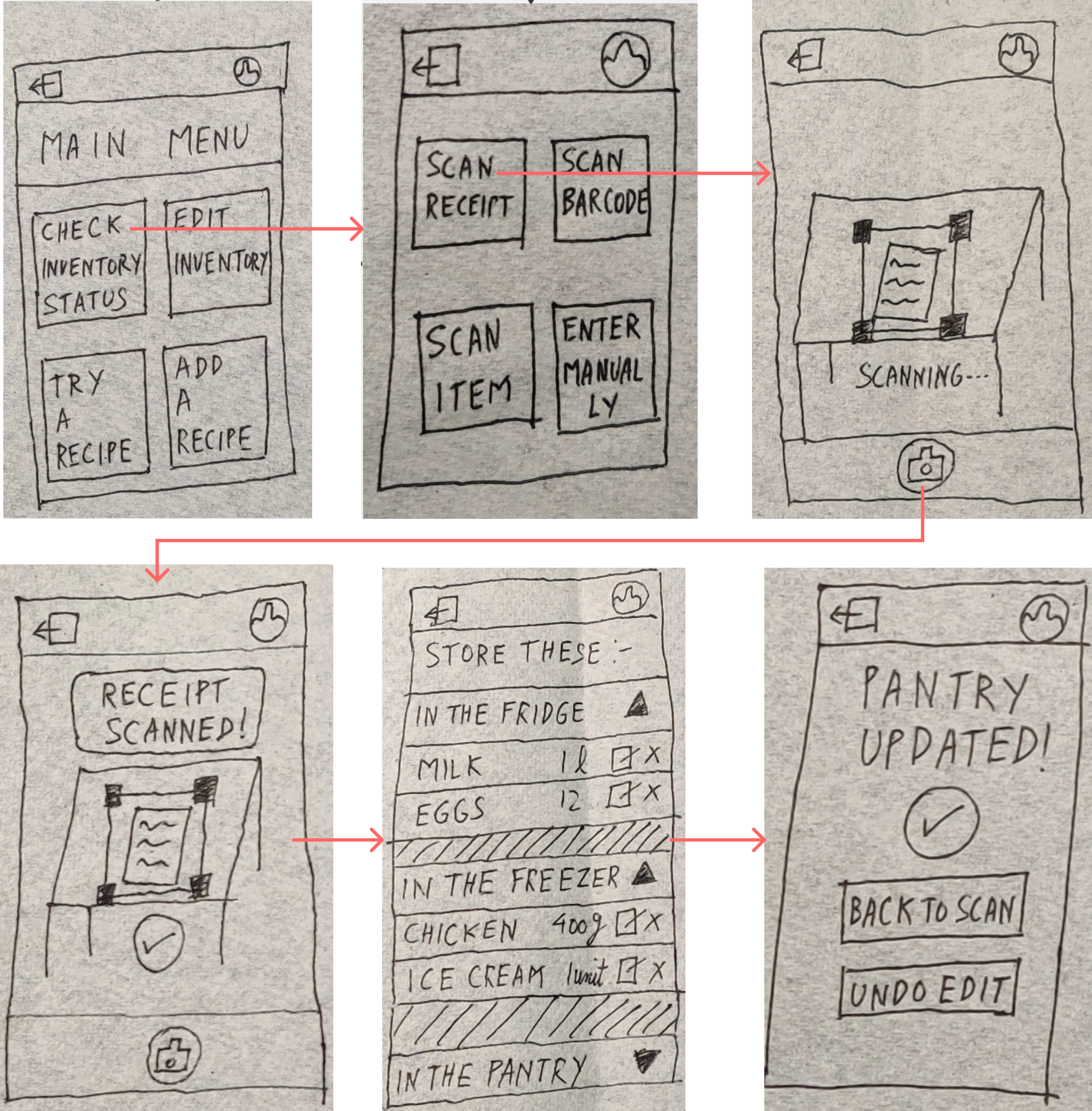
Flow 2: Receipt Scanning

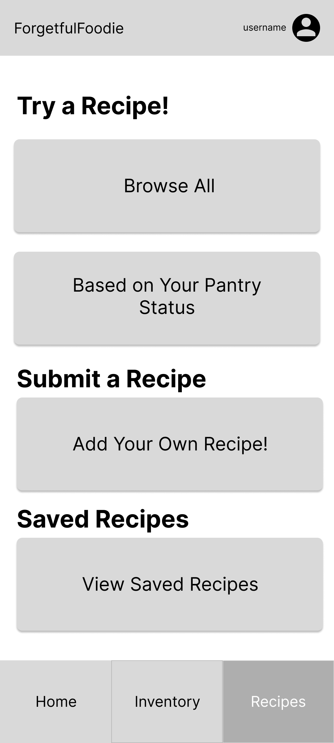
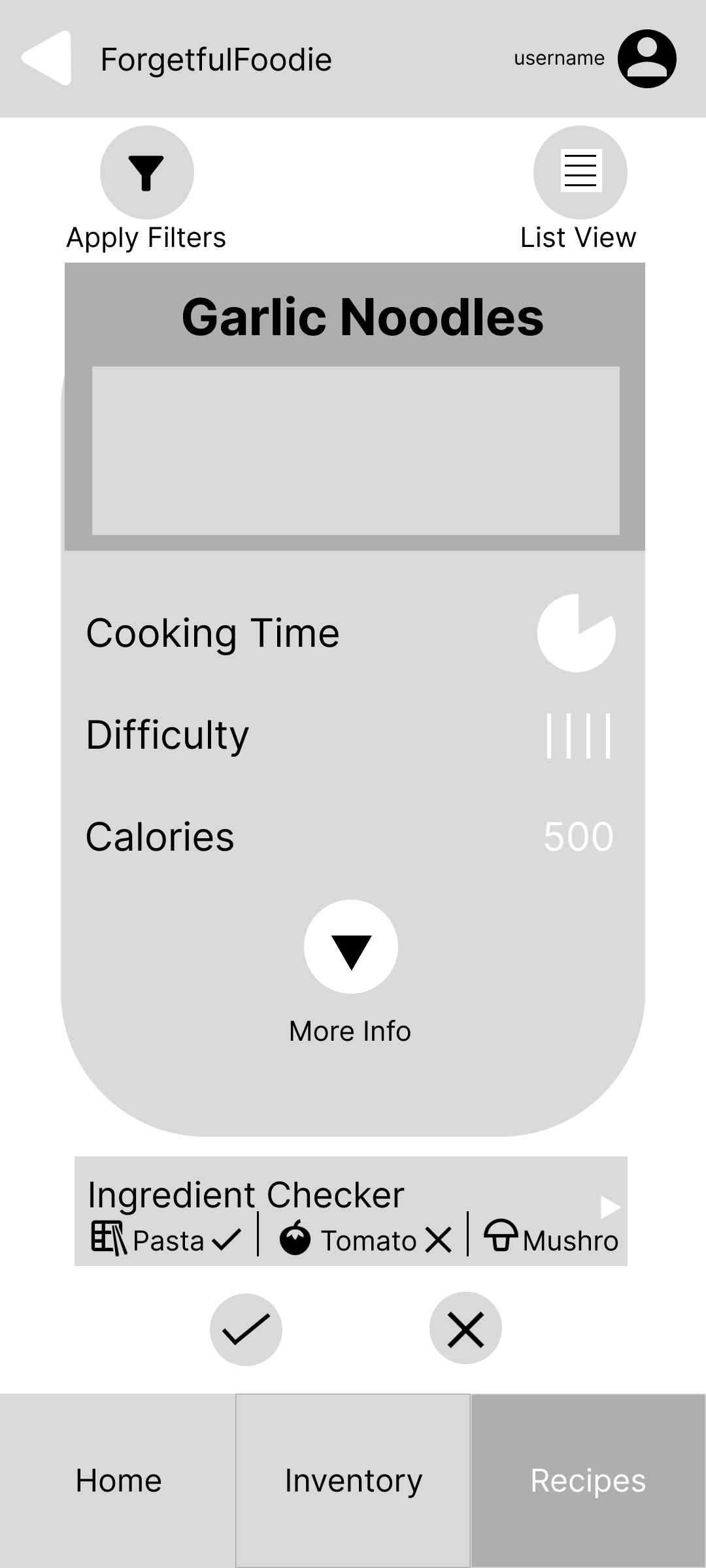
Flow 3: "Try a Recipe!"
We used these sketches as a guideline to base our digital wireframes' layout on.
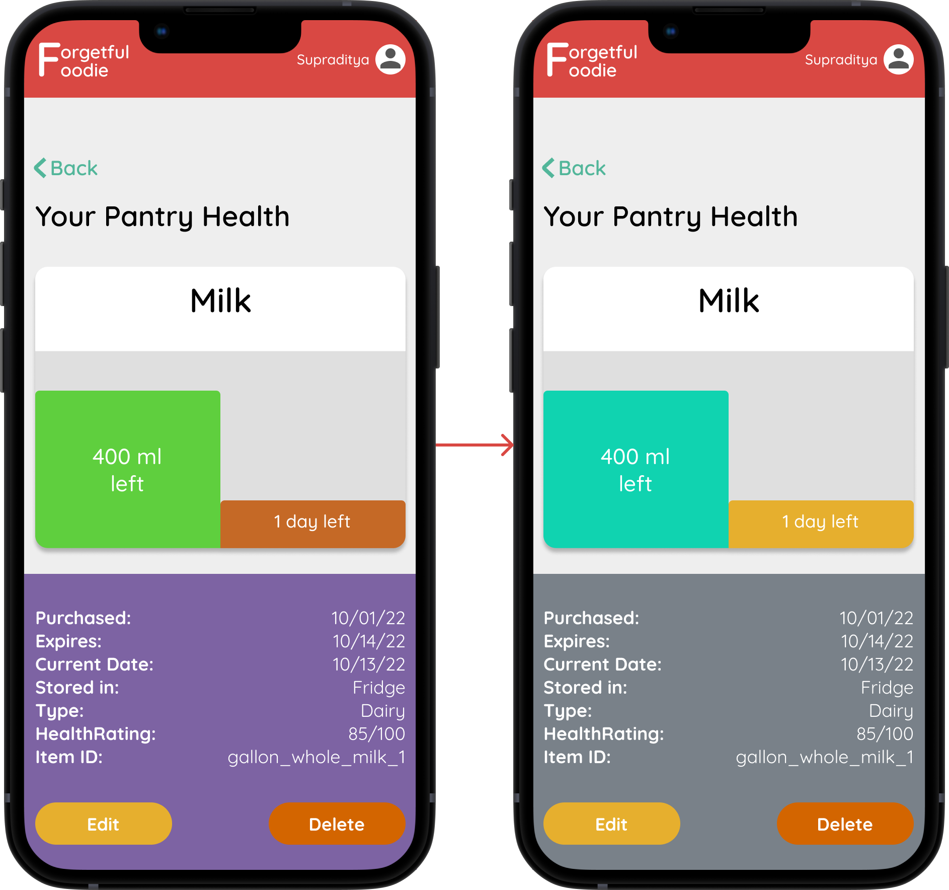
We decided that showing the quantity of a pantry item left, along with a countdown to its expiration date would require at least two graphs side-by-side.
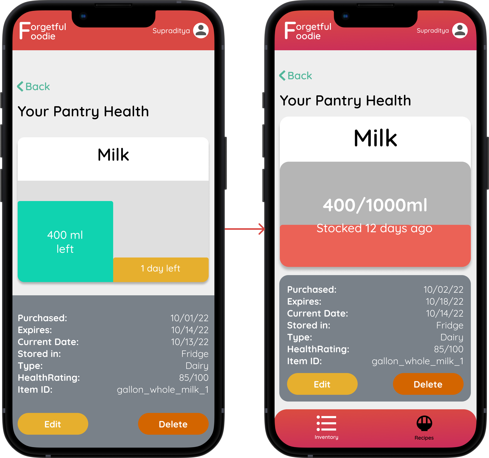
Additionally, clicking on a particular item should let the user fetch detailed information about it, along with edit/delete options.
Flow 1: Pantry Health
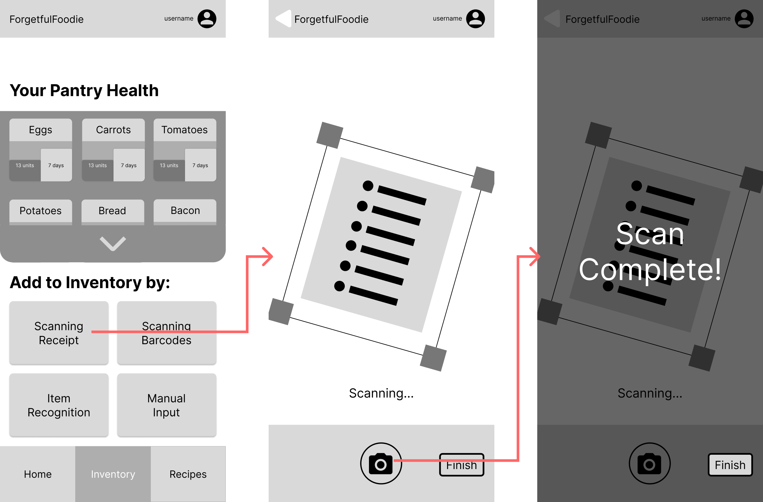
Flow 2: Receipt Scanning
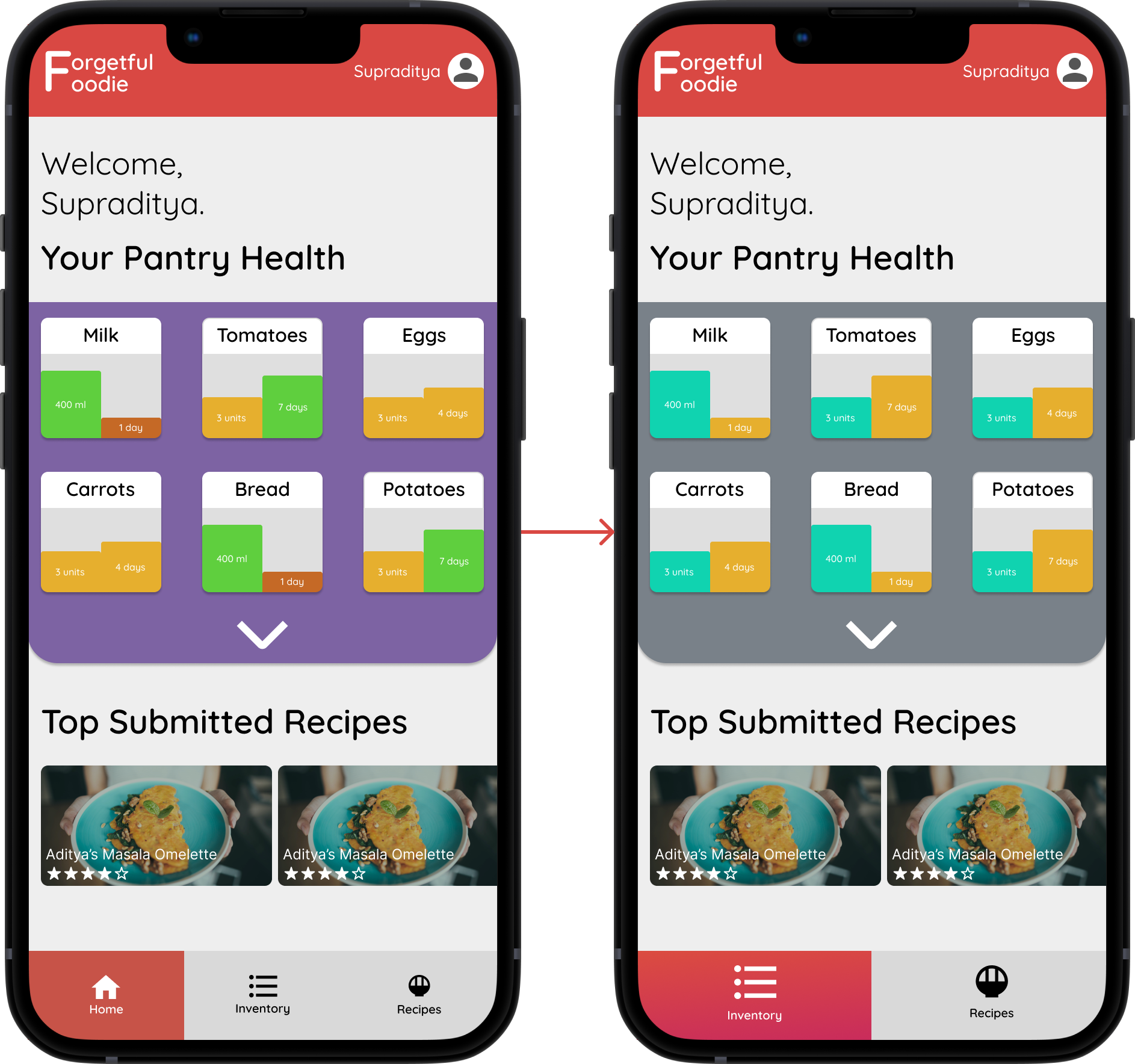
We decided that the application would have 3 menus:
- The home tab would show the user pantry health and some quick recipe options
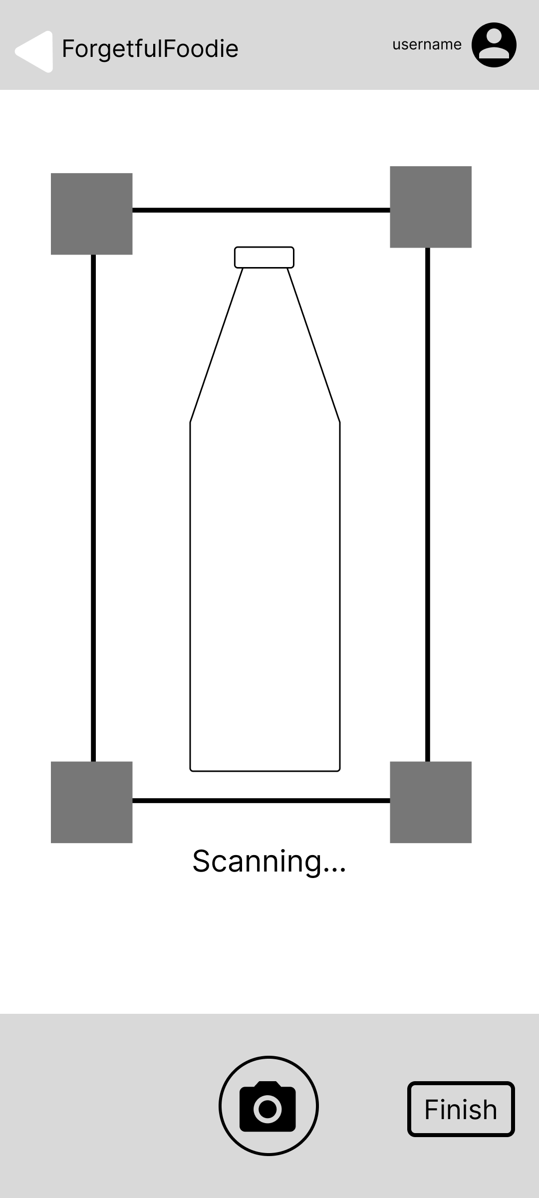
- The inventory tab would provide the user with alternative methods to update their pantry items, such as:
Barcode Scanning
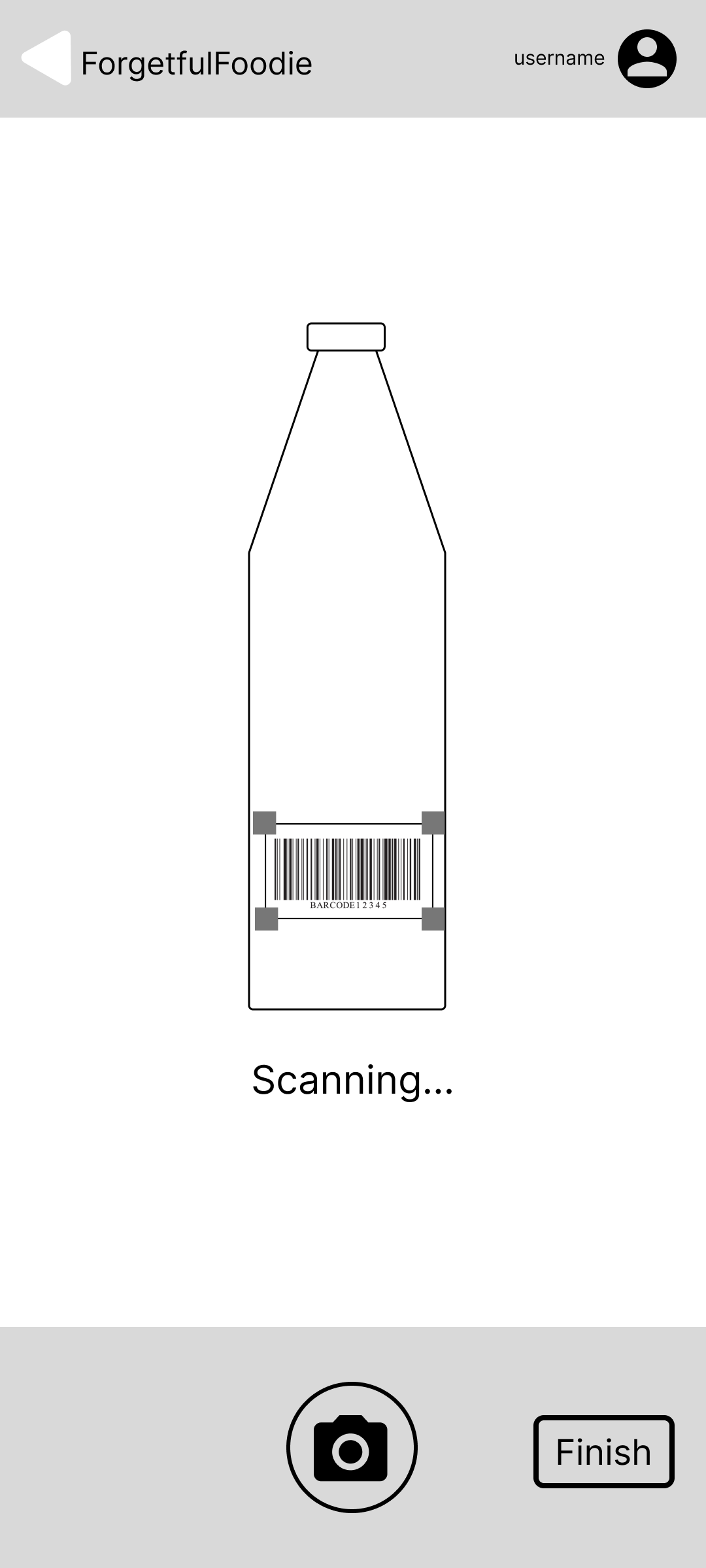
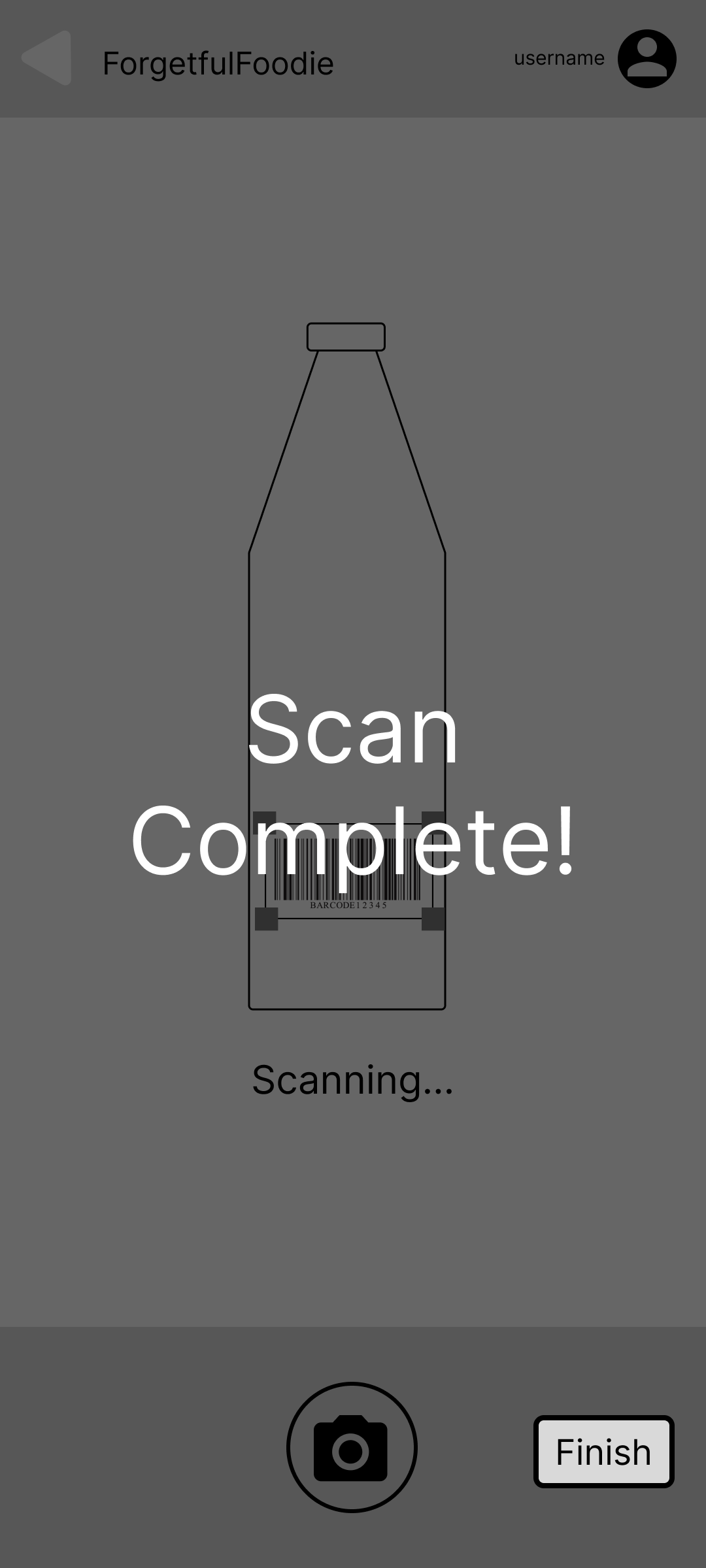
and Item Recognition

and finally, we also fleshed out the "Try a Recipe!" flow, providing the user the option to browse recipes based on their inventory, or just look up 'All Recipes.' As the name suggests, will allow the user to create, share and browse through user-recipes from the community.

These lofi frames were then given a splash of color, which gave us the opportunity to experiment with some color palettes and help us see what works best, which resulted in the following prototype
Phase 3: Feedback and Revisions
Feedback on Initial Prototype
Upon subjecting the above-developed prototypes to peer evaluation, we received a tremendous amount of insight:
- Users were confused by too many colors and graph bars
- Not sure what the 'store the following in' (a.k.a Storage Practices) page's function was
- The screen's original intention was to give the users a preview of what they'd entered, and to also give them storage recommendations for items.
- Users required an explanation in order to fully understand our intent, after which they found the feature to be useful.
- Too many menus and options to explore
The colors used for the different bar charts were found to be overwhelming to test users. They mentioned that they had to spend a considerable amount of time deciphering the pantry health visualization, which we realized was impeding the 'at a glance' philosophy and was making the initial learning curve steeper for the user.
Several users were hesitant about what to do next when directly presented with the Storage Practices screen after they input their new pantry items.
The home page, inventory and recipes tabs were a lot for users to take in all at once. It was also observed that users were unsure of the difference between the home tab and the inventory tab, since both of them displayed the pantry health visualization first, followed by different elements underneath that.
Revisions
- To address the problem 1, we went through two iterations to reach a solution:
- Initially, we tightened up the color palette to only use primary and secondary colors at most. Graph bar colors were switched out for more subtle and color blind-friendly alternatives.
- The second iteration led us to remove the 'days left' graph bar altogether, instead substituting it with a textual 'stocked x days ago' element on top of a single graph, whose sole purpose was to depict the item quantity. This helped us solve the problem of having to figure out expiration dates and periods, and leave it up to the user's judgment, and made our visualization more intuitive.
- We then addressed the user flow confusion that arose from the Storage Practices page, by adding an additional window specifically for users to review their item entries and make edits, following which we took them to the recommended storage methods window. This seemed to clear up any ambiguity experienced by users during tests after the change.
Revision 1: Home Screen and Pantry Health Visualization
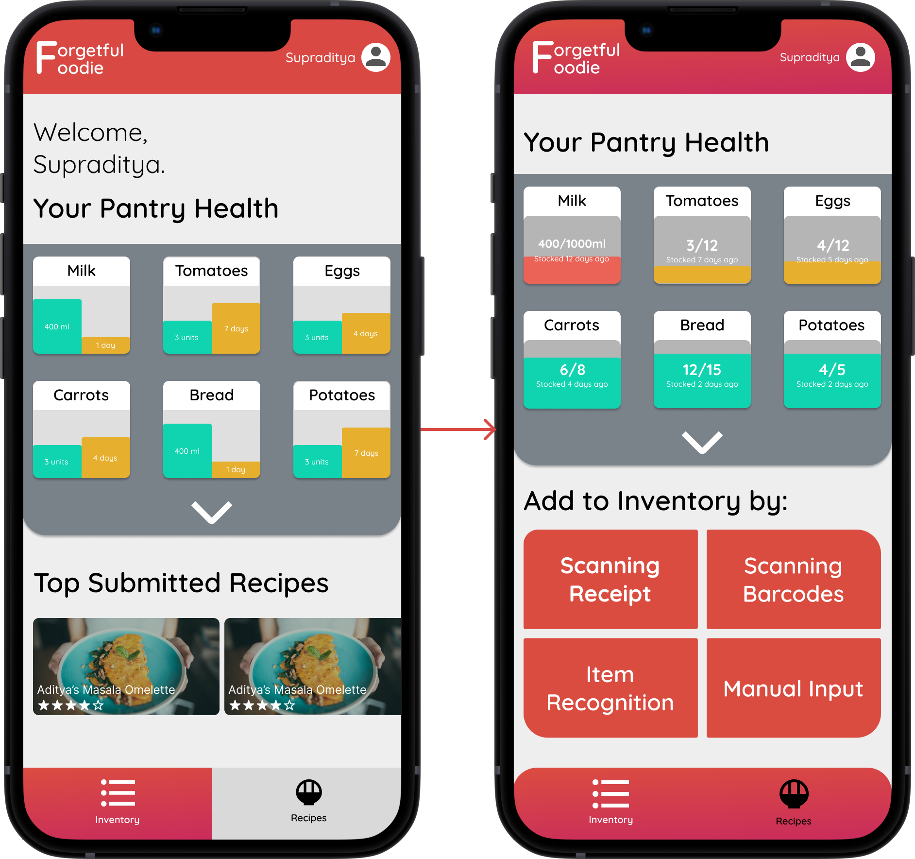
Revision 2: Home Screen and Pantry Health Visualization
Final Prototype
After incorporating everything discussed above into our redesign, we were ready with our final prototype.
Link to PrototypeFuture Scope
If we get the opportunity to further develop this prototype, we would love to focus more on the specifics of recipe submission and curation, and any new features that could improve the user's experience in that sphere.
Reflections
This is one of my first complete Interaction Design projects, and thanks to the course structure, we were able to delve into the entire process week-by-week, and understand the importance of iterative design based on feedback. The one learning lesson I took from this project was to inculcate a habit of documenting my activities as and when they occur, which would have helped me compile this study quicker and extract deeper insights overall.